Background Concepts:
Size Classes: A constraint can be made for a particular size class. Size classes are Compact, Any and Regular. Compact are for narrow or short screens while regular is for everything else. Most constraints are likely to be made with any, which means the same constraint will be used for any sized screen. To ensure you are creating constraints with 'any' selected you can on the size class selection in the upper left hand corner of the storyboard designer.
You can also change the size classes to see how they will lay out differently in different sized screens (well compact, any and regular).
Number of Constraints: A control will normally have four constraints that define its X/Y position, width and height. If you have more than four and didn't do it for a very particular reason (such as another control using the position of this control to do its layout), it is probably a mistake.
Control states: You can click on a control in interface builder to to toggle it's state from resize mode to constraint editing mode.
Resize Mode:
Constraint Editing Mode:
Valid Control State Indication: A control with a blue background is considered to have a valid set of constraints. A control with no constraints at all is also considered valid (it will have a fixed X/Y position and a fixed height and width).
A control with incomplete constraints will have an orange background.
A control with conflicting constraints will have a red background. This normally means you did something wrong.
Constraint editing mode
Normally you will choose a set of horizontal constrains and a set of vertical constraints.
Common Horizontal Constraint Sets:
Start at a fixed amount of space from the left with a fixed width.
Start at a fixed amount of space from the right with a fixed width.
Start and end with a fixed amount of space to the left and the right (control stretches and shrinks as the width of the screen does).
Control a fixed amount of space to the left or right of the center (can even be exact center) with a fixed width.
Common Vertical Constraint Sets:
Start at a fixed amount of space from the top with a fixed height.
Start at a fixed amount of space from the bottom with a fixed height.
Start and end with a fixed amount of space to the top and the bottom (control stretches and shrinks as the height of the screen does).
Control a fixed amount of space to the top or bottom of the center (can even be exact center) with a fixed height.
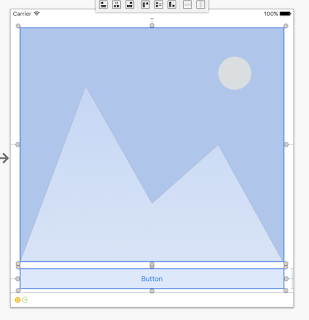
Control Combinations: Constraints don't just have to constrain controls to the edges of the screen or the center, they can constrain controls against other controls. Take the following example, the button is constrained to the bottom of the view with a fixed height. The image view is constrained at the top of the view and the bottom by the top of the button. So the button will always be the same height and space to the bottom and the image view will shrink and grow in height as the form does, always leaving the same spacing to the button.
Hiding controls: Controls that are not visible still have their constraints in place. That is to say they will still occupy the same space on the view and any other controls that are constrained by they will still lay out as if the control were visible. This is very different behavior than other systems like Android XML where if a control is marked as gone, the other controls re-adjust as if it didn't exist. In order to make an iOS control gone and any other controls constrained against it readjust, you may have to make some constraints have a zero height and / or width (constraint property) and then reset the constraints height and width when it becomes visible again.
There is certainly more to be learned about constraints but for anyone trying to understand them, I hope it gets you started.


ReplyDeleteAll your hard about curating this informative post on Xamarin iOS Autolayout Cheat Sheet that helps Xamarin Developer is much appreciated.
As we see it in Glorium, Xamarin bears loads of benefits especially important for small business and startups, like cost saving and time efficiency.
ReplyDeleteWe, at Adoriasoft.com, choose Xamarin as it is a perfect option when the one develops a project for small business or a startup. You can get one native app for three platforms at once, cross-platformly. It substantially saves time and money.
ReplyDelete